Why Mood Boards?
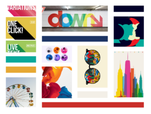
So, I wanted to do a post about one of my very favorite things: Mood Boards! I will basically put together a mood board for just about anything. I find them to be not only super fun to design but also very helpful for figuring out what a brand or even just a logo should feel like. It’s easy to say, “I want my brand to be fun, approachable, and quirky with a bit of a 70s pop art feel,” but it makes much more of an impact to see this:
Confession time: before Biller Designs got serious about doing website and design work full time, the brand wasn’t cohesive at all. I had slapped together a logo with all of the planning and intent of none at all and originally had this:
This isn’t terrible, but it was incredibly difficult to do anything with. The orientation is basically fixed, there aren’t any colors for thematic continuity, and the letters were sized in such a way that it wasn’t possible to just use pieces because breaking it up made it unrecognizable. On top of that, the website was kind of a hot mess in terms of visual consistency, but it didn’t occur to me that it was problematic until I did a branding exercise that began with a mood board.
When the mood board was finished and I was able to see the board all together, I was instantly able to define the voice and visual style of Biller Designs. Also, the shortcomings of the current brand were immediately apparent. With the board as a guide, I was able to make what I consider to be a very visually consistent and memorable website and brand style. My goal is to have such a specific visual voice, you could say, that when someone sees a worksheet I made for this blog or a piece of pop art in a Biller Designs social media post, they say, “Oh yeah, that is a Biller Designs graphic.” I also think it’s super important to watermark almost anything you create, but that’s a topic for another post. Seriously, I am writing it for next week. 🙂
Examples
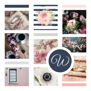
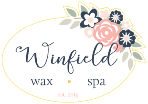
Let me give you another couple of examples. This is a board I did for Winfield Wax Spa in Winfield, KS. We set up a mutual secret Pinterest board and she pinned about 40 images that she liked for one reason or another. She commented on each pin what it was about each image that appealed to her.
Using this collection of images, we were able to nail down exactly how she wanted her new brand to feel: light, airy, floral, feminine.
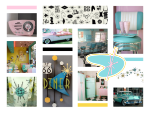
This last example is for another project from Tina and me called The Retail Chefs. We want to be able to use our specialty retail experience to help businesses coach and motivate their sales teams. We both love cooking (and cookware) and the food/chef/cooking theme really lends itself to the sales and marketing wordplay. It’s a lot of fun, honestly, but that brand originally suffered from some of the same visual continuity problems as the first iteration of Biller Designs. Here is the mood board I created to really define the visual language for The Retail Chefs:
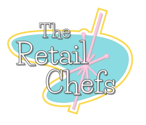
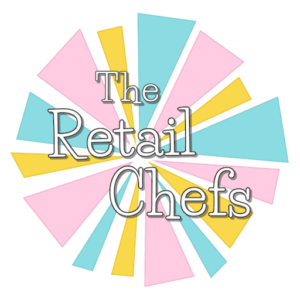
This whole brand is just a gas. I love working on it. The retro, atomic age radio and the sweet strawberry shakes on the teal diner chairs were the main informers of this palette. Here are some of the graphics that are based on this mood board:
 |
 |
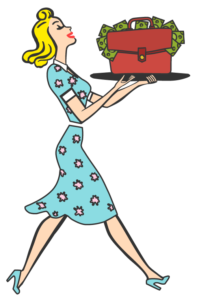 |
The colors and shapes just scream 1950s diner (which keeps the food thing going) and, again, it is very easy to see what is “on” brand and what isn’t.
It is our practice at Biller Designs to do a mood board for every client that is getting website design or logo design from us. As you can probably tell, it is very illuminating and absolutely worth the time to dutifully go through the whole process.
Until next time!
-CB <3
P.S. If you want to see the boards I am working on, check out Biller Designs on Instagram. I just like mood boards so they pop up in my feed pretty often. 🙂
And just because Mood Boards make me so happy:


